Thoughts on process: Tuning custom tools
May 7, 2025
Creating sliders that reveal more than they control
AI-powered coding environments like Cursor, Bolt and Lovable have made it easier to build custom design tools. Instead of grinding through boilerplate setup, you can sketch a GUI with sliders and checkboxes that control a canvas in just a couple minutes.
Stacking sliders is where things start to multiply. You can lean into what’s compelling about a design and quickly generate variations that push the idea in new directions.
Setting your own defaults
Sliders offer a way to fine-tune designs with instant visual results. I remember sitting with a more experienced designer and realizing that a project we both admired had come from nothing more than nudging a few default settings in Photoshop. I think this is a flaw of Photoshop, and tools like it — hiding the idea that small adjustments can make a huge difference.
In the tools I design now, sliders are set to a random step of the range on refresh, avoiding a tired, neutral baseline. Every new session can feel fresh by lightly suggesting unexpected directions.
Fragments over complete work
Recently, I built a small poster generator website that automated layouts within a set of constraints: fixed typography, color palettes, a few gradient patterns, and preset export sizes. The basic system worked, but the most interesting feature turned out to be a slider for type treatments.
Custom gradient poster generator tool
Instead of just setting font size or weight, the slider moved across a range labeled technical to minimal. There were six distinct settings in between — each representing a slightly different typographic expression. It wasn’t perfect, but it felt novel: shifting typography across a tuned scale rather than starting from scratch every time.
This process made me realize tools aren’t just time savers. They’re a way to study what makes a design feel a particular way, and to notice which changes actually shift the tone of the design.
Designing for discovery
When designing a GUI for a creative tool, it’s tempting to account for every possible combination — but leaving gaps creates space for discovery.
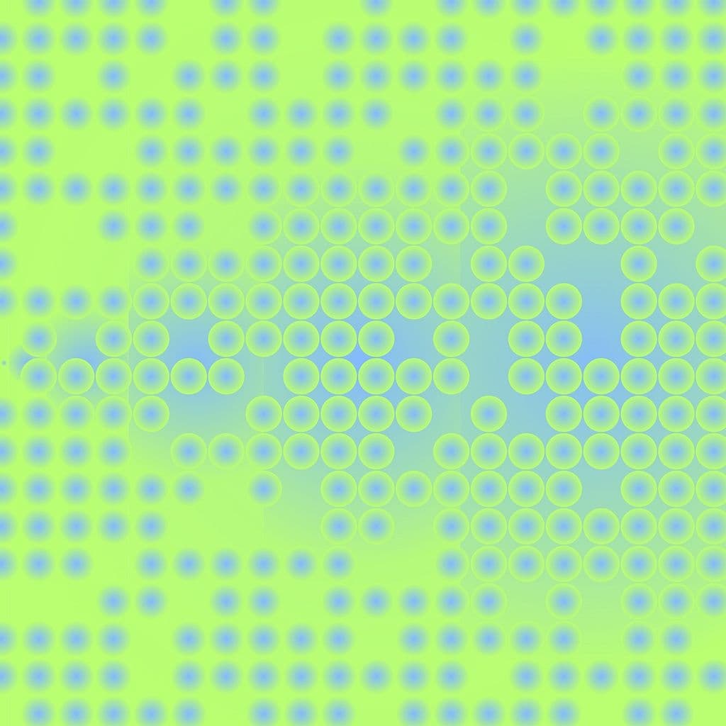
If the tool breaks, that’s fine. Sometimes the broken version produces more interesting results than the intended one. In the case of the poster generator, I leaned into a “bug” where changing the canvas aspect ratio allowed multiple gradients to stack unexpectedly — producing more complex and layered visuals than I’d originally planned.
The process of setting up sliders — defining ranges, labeling parameters, and tuning defaults — forces you to think about the creative space you’re enabling. Dynamic defaults hint at what’s possible and what might be worth trying, without needing to account for every edge case. There’s a temptation to tightly control every slider, but building tools with unique parameters can reveal more than what they directly adjust — it’s a way to learn what really shapes a design.
Check out the example poster generator here.